Where Mosquitos Glow
My Graduation Project “Where Mosquitos Glow” was an open world Video Game made in Unreal Engine. Atamai and Sikota were stranded on a remote pacific Island, the biologist Benzu (controlled by the player), originally drawn…
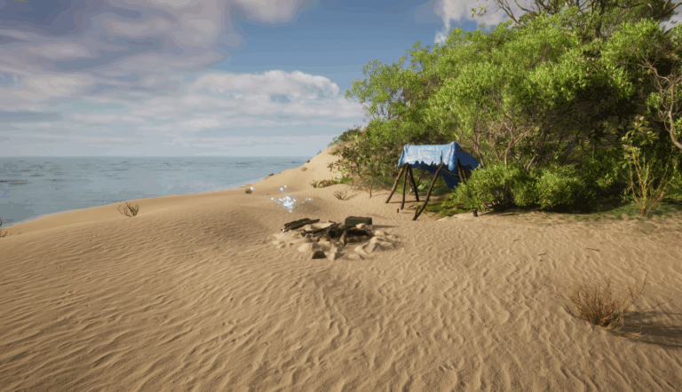
My Graduation Project “Where Mosquitos Glow” was an open world Video Game made in Unreal Engine. Atamai and Sikota were stranded on a remote pacific Island, the biologist Benzu (controlled by the player), originally drawn…
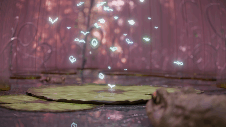
A fun little project inspired by bathroom curtains and, very loosely, the Hunger Games. Most of the focus was on the textures and colours, just finding a look that feels aesthetically soothing. One of the…
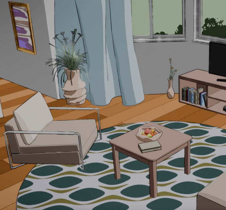
An experiment with depth perception. Toon shading was used to create a 2D effect, which is then revealed to be 3-dimensional with the camera movement. Some Assets from fab.
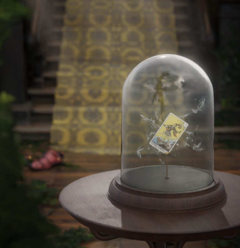
Another render challenge, that was mostly an exercise in composition, making sure there were elements in the foreground and background as well as enough focus on the main subject.
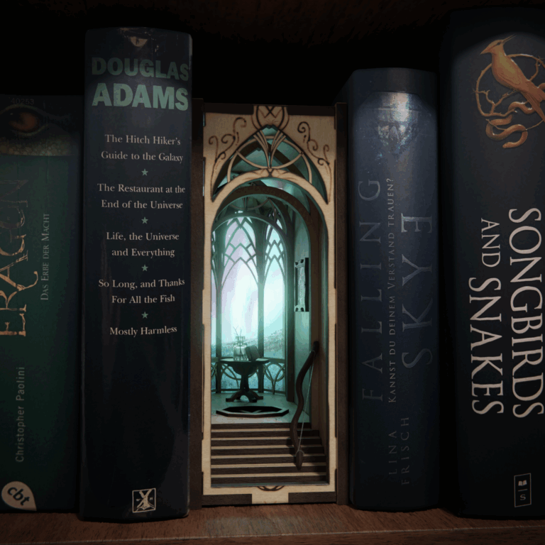
A bit of an older Project, but I still believe it deserves to be uploaded. The Idea was a bit of a fantasy Diorama portraying the feeling that books contain their own little worlds in…
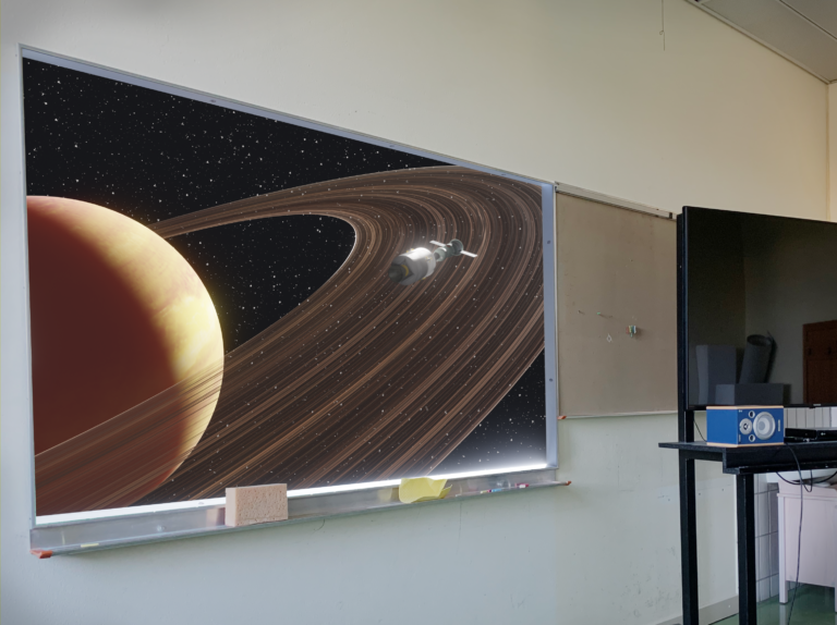
This was a project aiming to capture the concept of endo- and exo-worlds in an Image. That is the thought that as an end-observer you are located within the system you are observing, whereas exo-observer…
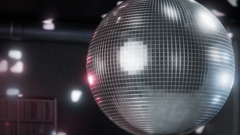
This one was meant to be a weekly challenge, but some things came up and I ended up only having about half a day to work on it. I still feel good about the post…
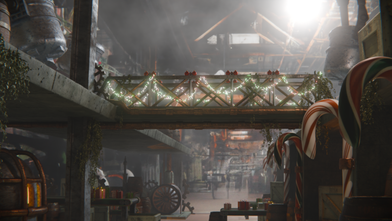
A little Christmas spirit in this one, I did a perspective match/set extension sort of thing with a background image in the distance blending into 3d Modelled stuff.
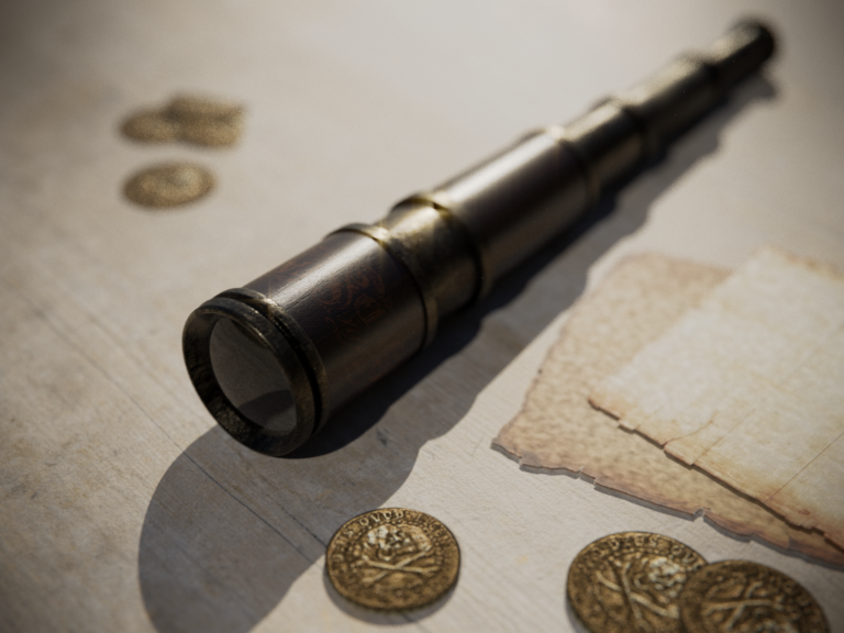
A fun little project I did, not much work (it was a daily challenge). I was debating whether to upload this seeing as there are some pretty obvious flaws, but the main reason for them…

This one is a huge departure from my usual style, which I see as a good thing. I’m really happy with how it turned out, not perfect, but it was super fun adding all the…

This project was a weekly challenge. I’m not thrilled with the galaxy or the reflections in the window, but I did have a decent amount of lore in mind so at least the setting makes…

This image was made with the help of a fur tutorial, with the focus being on learning fur shading and lighting. I thought it looked like a default apple background, so it’s my phone’s lock…

This is a 3D recreation of a real mug from my Kitchen. I made the graphic texture in Illustrator, and did some hand painting for the roughness. The Objects in the background are downloaded assets.

This was a Subdivision surface modelling project, with the focus being on modelling and rigging the whale. It’s called fish because that was our assignment. I had one job

An abstract cell shaded project. I worked with traditional techniques, geometry nodes and AI to create something fitting the theme “Window”

This is a large scale environment project I did as a weekly challenge. The main focus was being able to render the scene without giving my laptop a heart attack.

A short animation done from scratch in a span of approximately three weeks. All the textures are hand-painted, as I wanted to try out a new stylised workflow
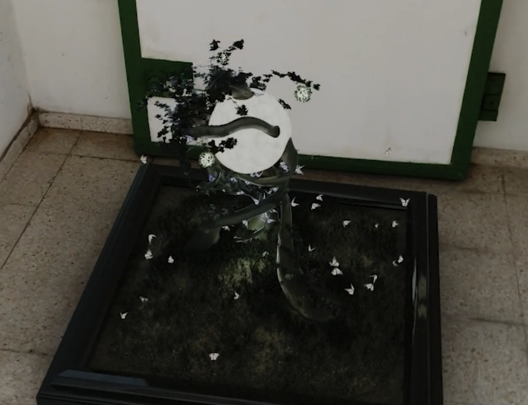
A school project we did, focusing mainly on motion tracking. The render itself isn’t that good, but I’m pretty pleased with how it integrates into the real footage